

Building a useful colour palette
Not a seasonal palette — a working one, derived from what you actually reach for.
MODAME Journal ·
A palette is a system
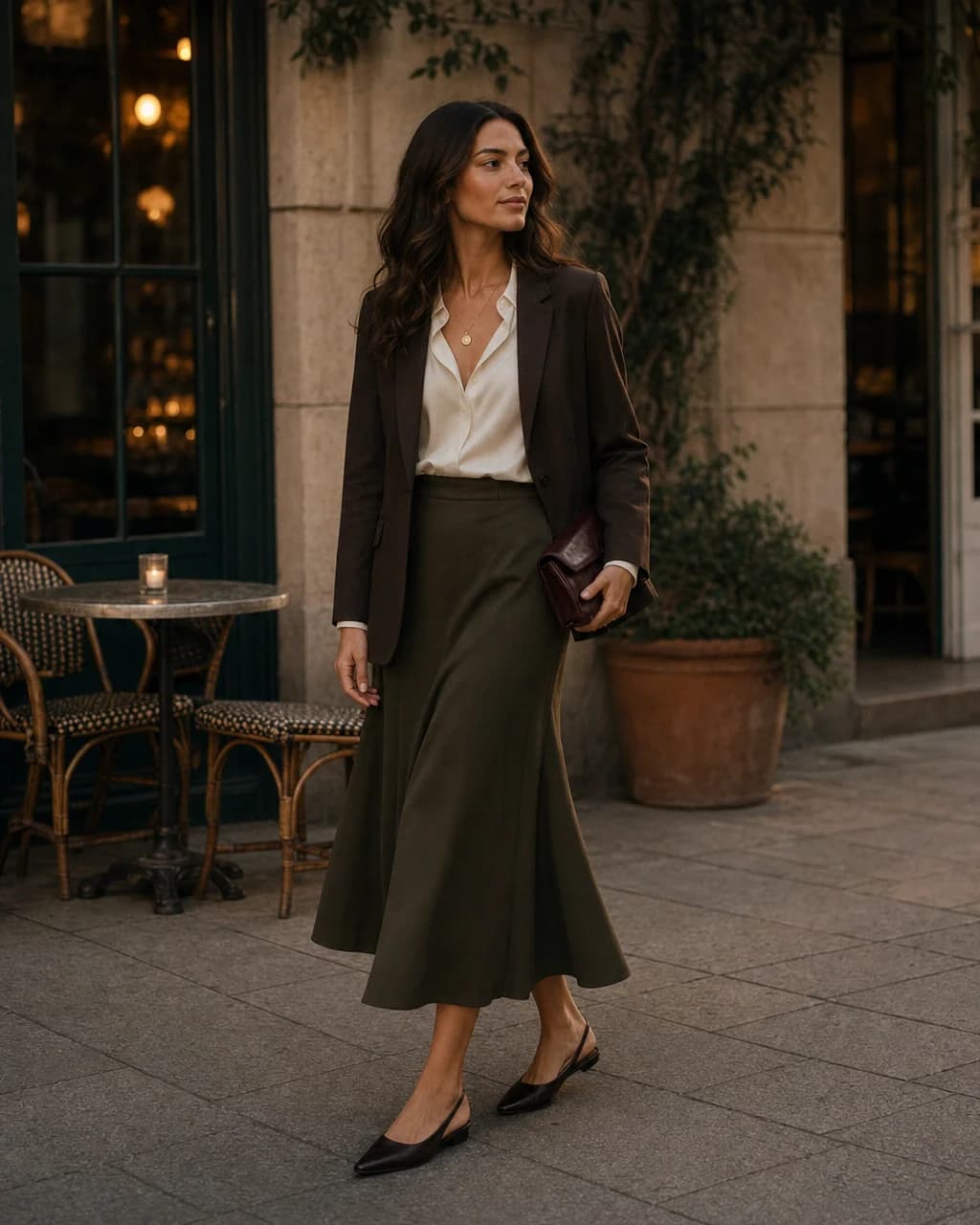
Colour advice often begins with categorising the person: a season, an undertone, a set of approved swatches. Complexion matters, but a wardrobe palette must do more than flatter a face. It has to work across outerwear, trousers, shoes, changing climates and differing levels of formality. It has to survive laundry schedules and make sense at seven in the morning.
A useful palette is therefore a system of relationships. It contains colours that meet one another easily and perform distinct roles. Some form the background, some connect, and a few provide emphasis. The aim is not perfect harmony or a ban on spontaneous colour. It is to make most of the wardrobe mutually intelligible.
Begin with evidence
The best starting point is not a colour wheel but the clothes already in regular rotation. Gather the pieces worn most often over several weeks, including shoes and coats. Their palette may be quieter than the full wardrobe and more revealing. A person who believes they love bright colour may discover that it appears mainly in scarves, while navy, cream and brown carry the actual outfits.
Photographs help because memory gives unusual outfits too much weight. A simple record shows frequency and context. Notice not only which colours appear, but where they appear. Black may work in footwear but feel harsh near the face. Olive may be excellent in outerwear and difficult in shirts. Mid-blue might be the bridge that joins both work and weekend clothes.
Choose the foundations
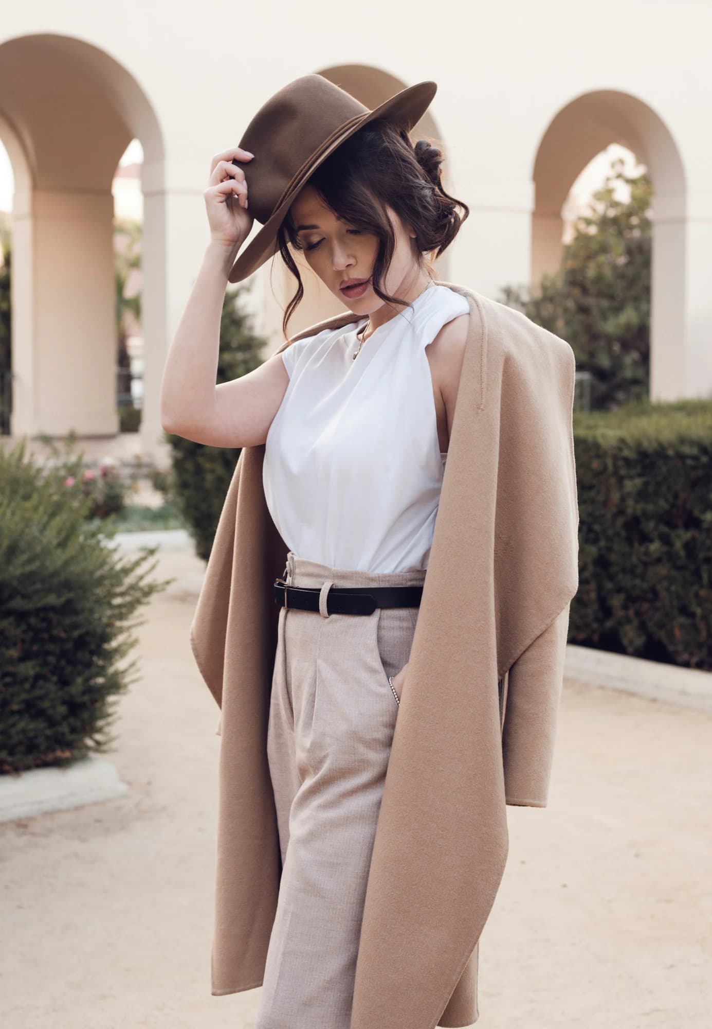
Foundation colours occupy the largest visual areas and the costliest garments: coats, jackets, trousers and often shoes. They need not be conventional neutrals, but they should tolerate repetition. Navy, charcoal, brown, olive, cream and softer blacks work well because each contains nuance and ages with dignity. Two or three foundations are usually enough to begin.
Their compatibility matters more than their individual prestige. Navy outerwear with brown footwear and cream trousers offers an immediate set of relationships. Add white and mid-blue shirts and the combinations multiply without becoming monotonous. By contrast, six striking colours that each demand a different neutral can create a vivid but fragmented wardrobe.
Supporting and accent colours
Supporting colours sit between foundation and accent. They might be pale blue, tobacco, burgundy or a softened green: distinctive enough to change an outfit, familiar enough to appear more than once. They work particularly well in shirts, knitwear and lighter layers, where colour can move through the year without controlling every other choice.
Accent colours can be rarer and more specific. An oxblood bag, saffron scarf or deep red knit may animate a restrained palette. The test is not whether an accent matches everything, but whether it has at least two credible routes into the wardrobe. An isolated accent that requires new shoes, a new coat and unusual confidence is not an accent; it is the beginning of a second wardrobe.
“A coherent palette does not remove colour. It gives colour company.”
Footwear sets the boundary
Shoes are often left until the end of colour planning, despite being one of its structural elements. Their weight and formality matter, but their colour also decides which trousers feel resolved. Warm brown can soften navy, cream and olive. Black can sharpen charcoal and darker denim. A pale trainer may connect summer colours while looking exposed beneath heavy winter cloth.
A practical palette includes two or three footwear directions that overlap rather than divide the wardrobe. This is especially valuable for travel and work, where an otherwise versatile outfit can fail because its only suitable shoe is unavailable. Belts and bags need not match precisely, but a related temperature often creates calm.
Climate and context
Colour behaves differently in different light and fabric. Mediterranean sun can make cream, tobacco and faded blue feel substantial; the same tones in a dark winter office may need deeper grounding. Linen holds colour softly, while polished leather or synthetic cloth can make an identical hue feel louder. A palette should account for material as well as pigment.
Work and casual life may also require different degrees of contrast. The solution is not necessarily two separate palettes. Shared foundations can connect them: navy trousers at work, navy overshirt on weekends; brown loafers with tailoring, brown suede with denim. The most useful colours cross contexts while changing expression through texture.
The six-colour example
Consider a wardrobe built around navy, cream, white, mid-blue, brown and olive. Navy can occupy jackets and trousers. Cream can soften knitwear and summer bottoms. White and mid-blue provide shirts; brown anchors shoes and leather; olive introduces a natural supporting tone. Almost every top can meet almost every bottom, while outerwear has more than one route through the set.
This is not a prescription. Someone else might replace navy with charcoal, brown with black and olive with burgundy. The principle is role and relationship. A useful palette has enough contrast to create shape, enough continuity to create combinations, and enough individuality that the wardrobe does not feel borrowed.
Let the palette move
A working palette should remain open. Skin, hair, climate and taste change; so do jobs and habits. Introduce a new colour through a low-risk layer or accessory, then watch whether it finds natural partners. If it is repeatedly worn, it may deserve a larger role. If it remains admired but isolated, no rule has been broken; the experiment has simply produced information.
The value of a palette is not aesthetic tidiness. It is the freedom to dress with fewer dead ends. When colours already understand one another, attention can move to texture, proportion and mood. The wardrobe becomes more expressive because less energy is spent forcing its parts to agree.
Maintenance can reveal another layer of evidence. Colours that fade attractively, hide ordinary wear or wash together tend to remain available. Those that require separate care may spend longer out of rotation. This practical rhythm deserves a place in the palette alongside complexion and taste, particularly in wardrobes expected to work hard.
Finally, leave a little imbalance. A perfectly controlled palette can feel like a showroom rather than a life. The unusual inherited scarf, the saturated holiday shirt or a much-loved colour that combines with almost nothing may deserve its place precisely because it interrupts the system. Coherence should make expression easier, not remove the exceptions that carry memory.